

With their vibrant hues and intricate patterns, Persian Rugs are an amazing way to add texture and colour to a home. But these exact qualities can make styling them an interior challenge.
Well, it’s time to dust off that colour wheel you left in high school art class. Knowing the basics of colour theory can demystify interior decorating, and can help you create the perfect canvas to show off your new Persian Rug.
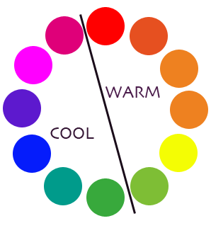
Cool vs. warm: what’s the difference?
Like any pre-schooler worth their salt, you know reds and oranges are warm, and blues and greens are cool.
But have you considered the way they can change the feel of a room - Warm colours tend to create a lively, intimate ambience while cool colours promote calm and relaxation.
As a general rule of thumb, you should try to use cool tones in small spaces and warm tones in larger ones - otherwise, your room could look crowded or stark. Keep these principles in mind while selecting the right Persian Rug for your home.
|
| Image credit: https://au.pinterest.com/pin/307511480779687596/ |
Understand the way the eyes work
We’re like magpies when it comes to colour. Our eyes naturally gravitate to the brightest colours - but if there’s too many in our line of vision, we feel overwhelmed and don’t know where to look. If your Persian Rug is already a vivid shade, make neutrals your new best friends.
Get in harmony
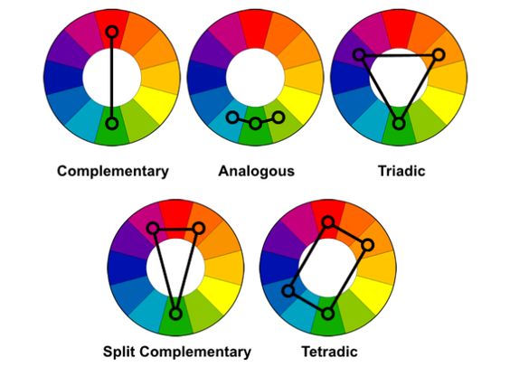
According to colour theory, harmonious colour combinations use any two colours opposite each other on the colour wheel, any three colours equally spaced around the colour wheel forming a triangle, or any four colours forming a rectangle. You can shift the angle on these to any rotation, but the colour schemes will always remain harmonious. Cool, huh? This diagram gives a handy visual, but it can be helpful to download an app like ColorSchemer, which allows you to mix and tone colours to create shades that aren’t discernible on a simple colour wheel.
|
|
| Image credit: https://au.pinterest.com/pin/513832638715955158/ |
Now, let’s go into the specific colour schemes and how you can use them to style your Persian Rug:
Complimentary
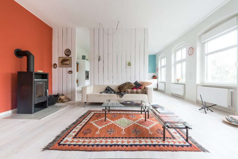
When done right, complementary shades - the colours directly opposed to each other on the colour wheel - can make quite a statement. But get it wrong, and you have a visual train wreck. So how to keep the look high-impact without giving you a headache? It’s all in the neutrals. These non-colours give your eyes space to rest, and prevent the room from being chaotic. Take the Berlin apartment pictured below. Striking burnt orange and blue feature walls accentuate the complementary colours already present in the Persian Rug - but the white canvas beautifully offsets it, making the overall effect eye-catching yet calm.
Analogous
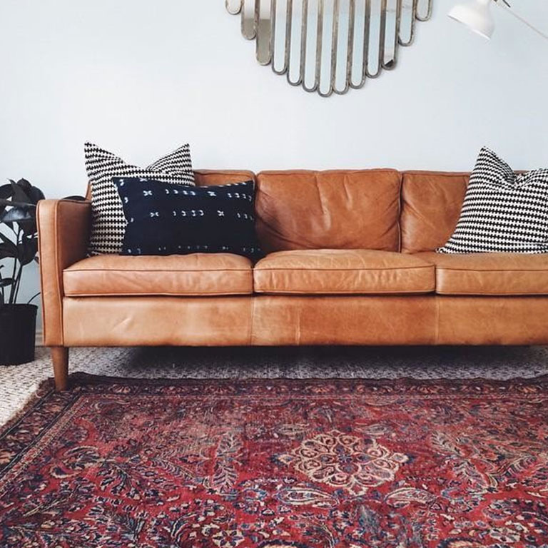
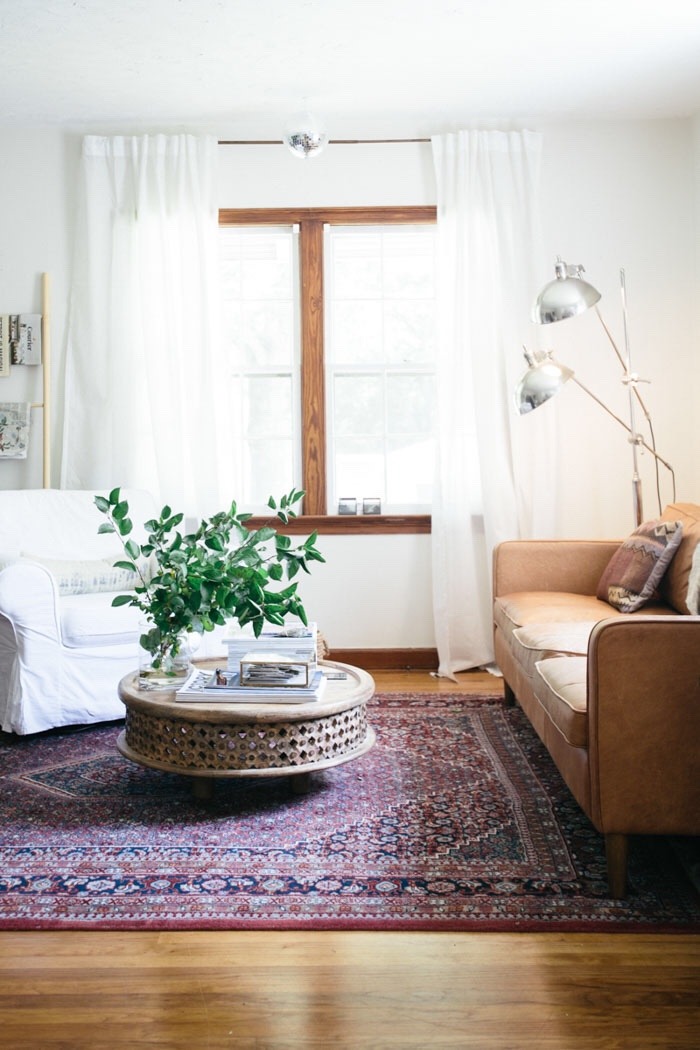
This nearly fool-proof colour scheme involves choosing three or more hues that are next to each other on the colour wheel to create a sophisticated, restful arrangement. But don’t think this colour harmony is boring or uninspired: in the image below, surprising splashes of graphic black and white update this otherwise safe scheme.
Triadic
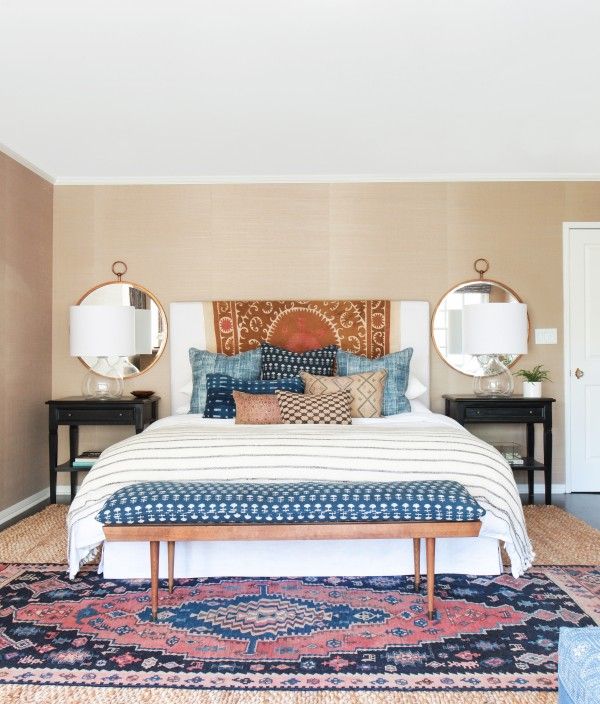
Choose three colours that are evenly spaced around the colour wheel - so in the shape of an equilateral triangle - to create a vibrant triadic colour scheme. This look, beloved by artists, is best used when one colour dominates and the other two are used sparingly for accent. The lovely bohemian bedroom below uses triadic shades of pink, orange and blue in just the right balance.
Split Complementary
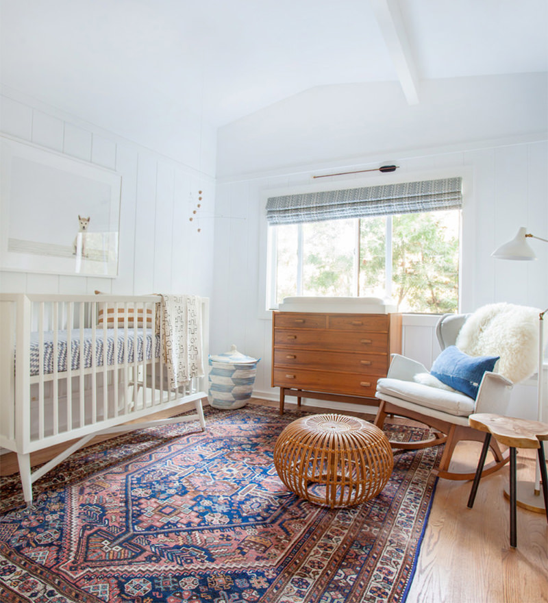
Choose a primary colour and the two colours that lie on both sides of the primary colour's opposite. This variation on the complementary colour combination is more subtle while still providing high contrast. In the look below, dusty pink and copper juxtapose the cobalt blue of the Persian Rug - while a cushion in the same shade of blue packs an extra punch of colour.
Tetradic
Select four shades to create two complementary colour pairs, which should look like a rectangle shape on your colour wheel. On first blush, this sounds like it could be chaotic - and it can be a difficult one to master. But when done right, it’s breathtaking. Take the example below - the complementary shades of purple and green, and blue and orange are used with restraint, offset by a white canvas to striking effect.
Ready to find the perfect Persian Rug to complete your dream living space? Browse our online collection at PersianRugs.com.au or visit our Rozelle warehouse to find the right one for you.